
Epitre
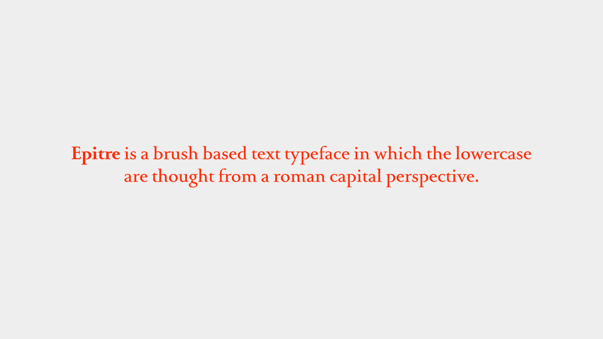
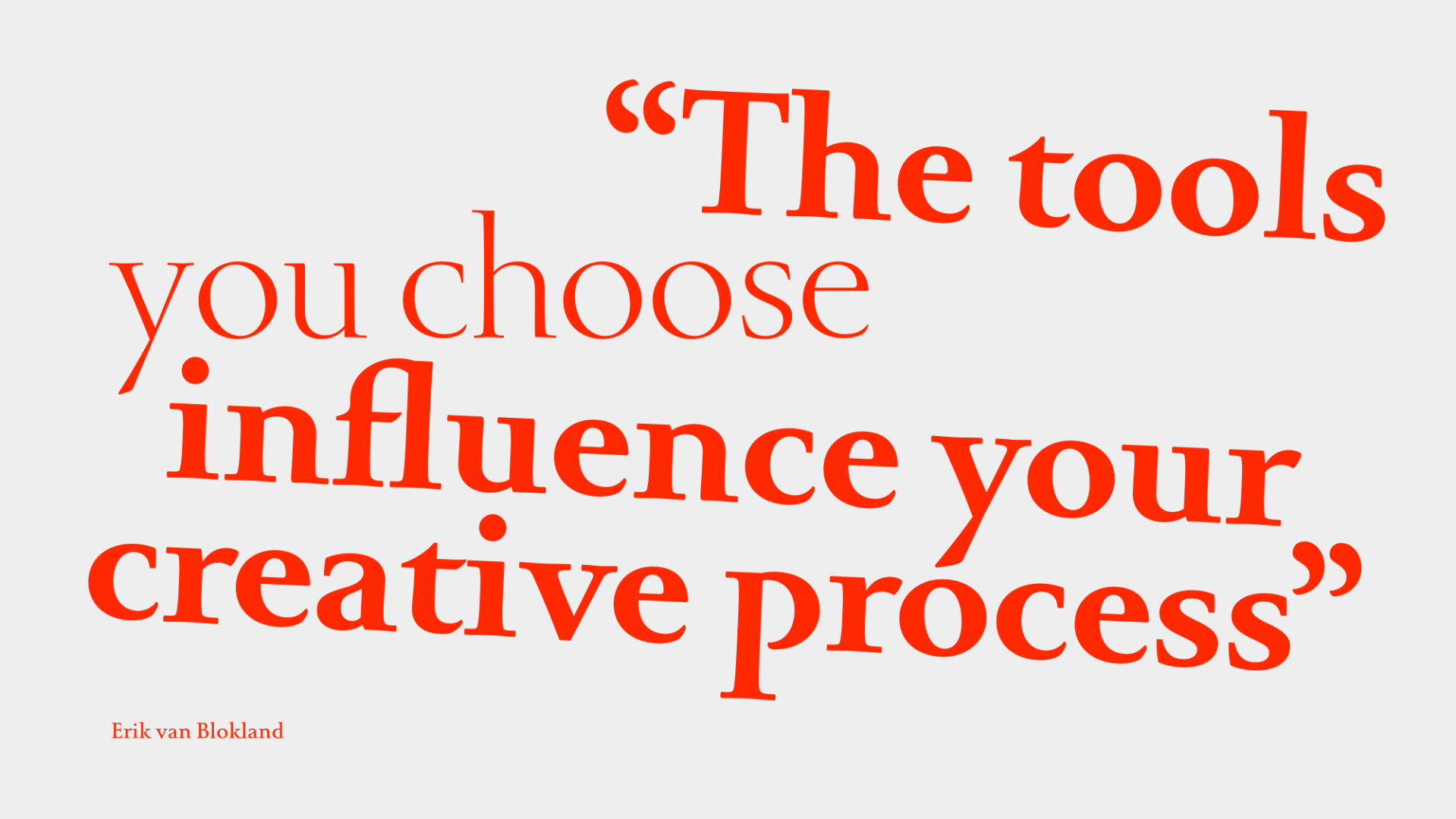
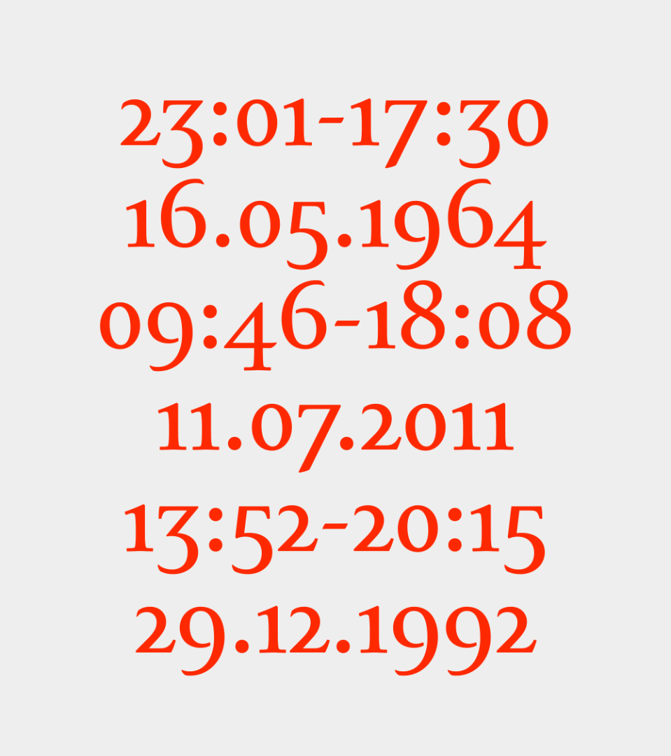
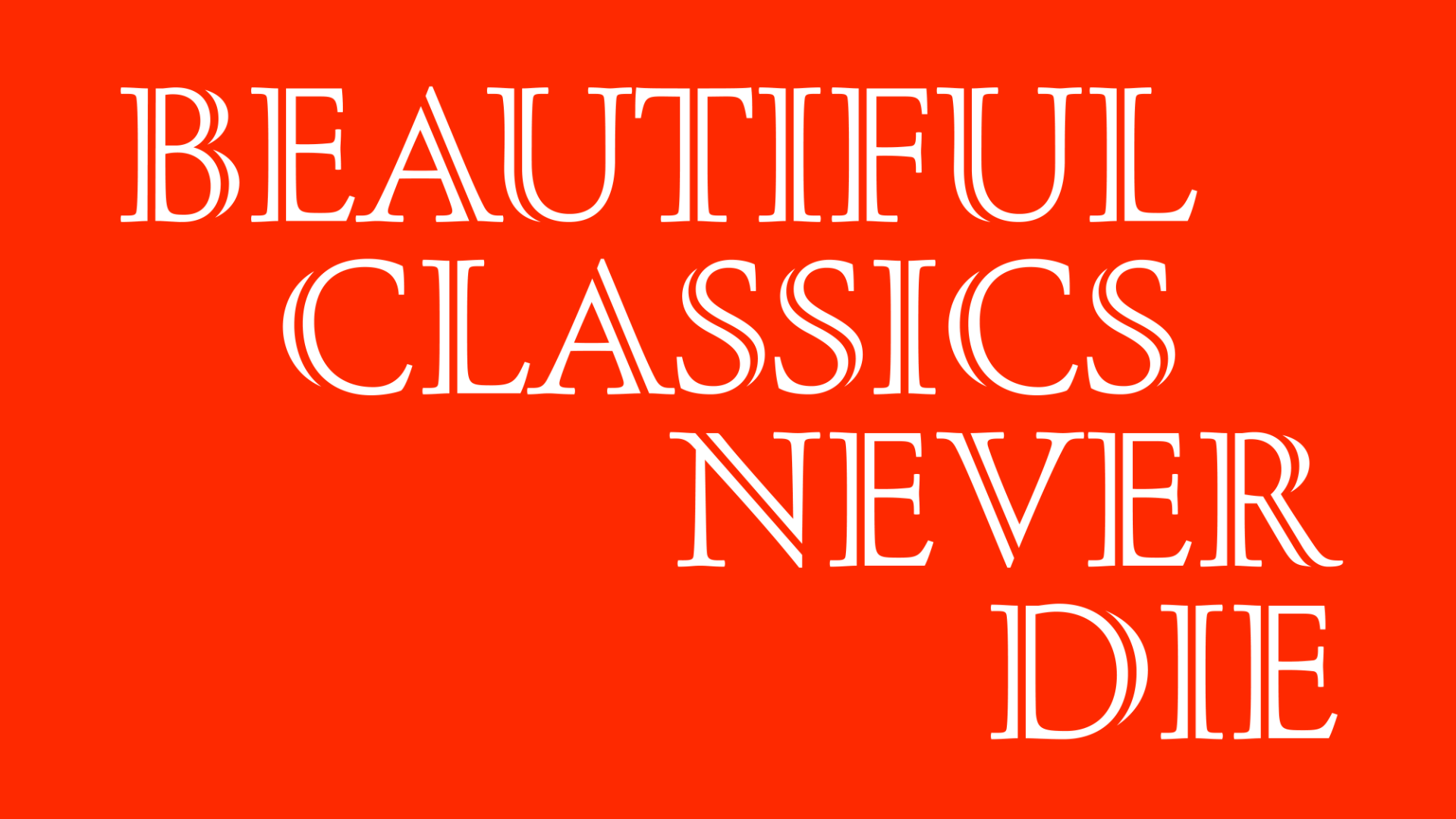
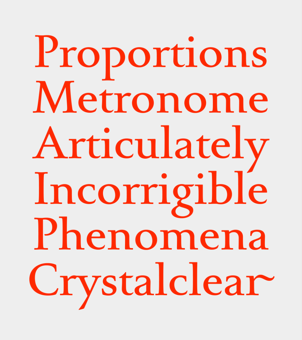
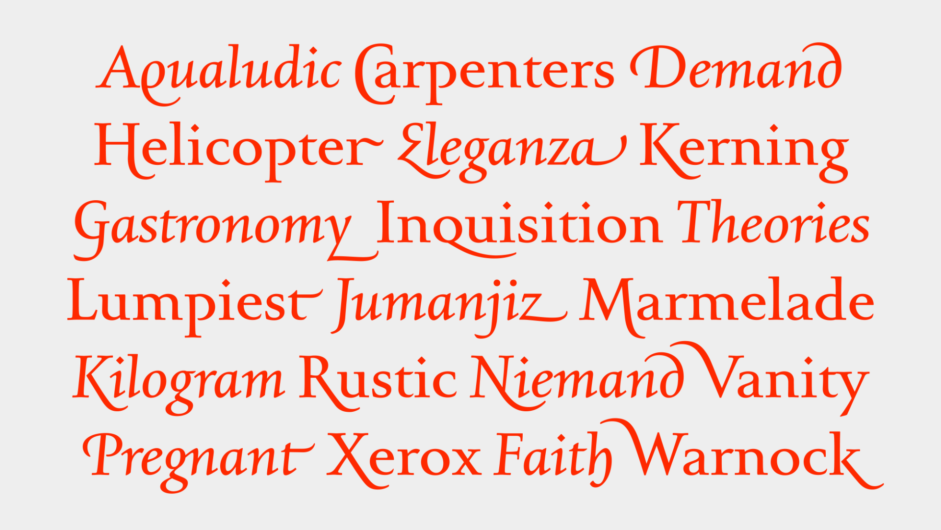
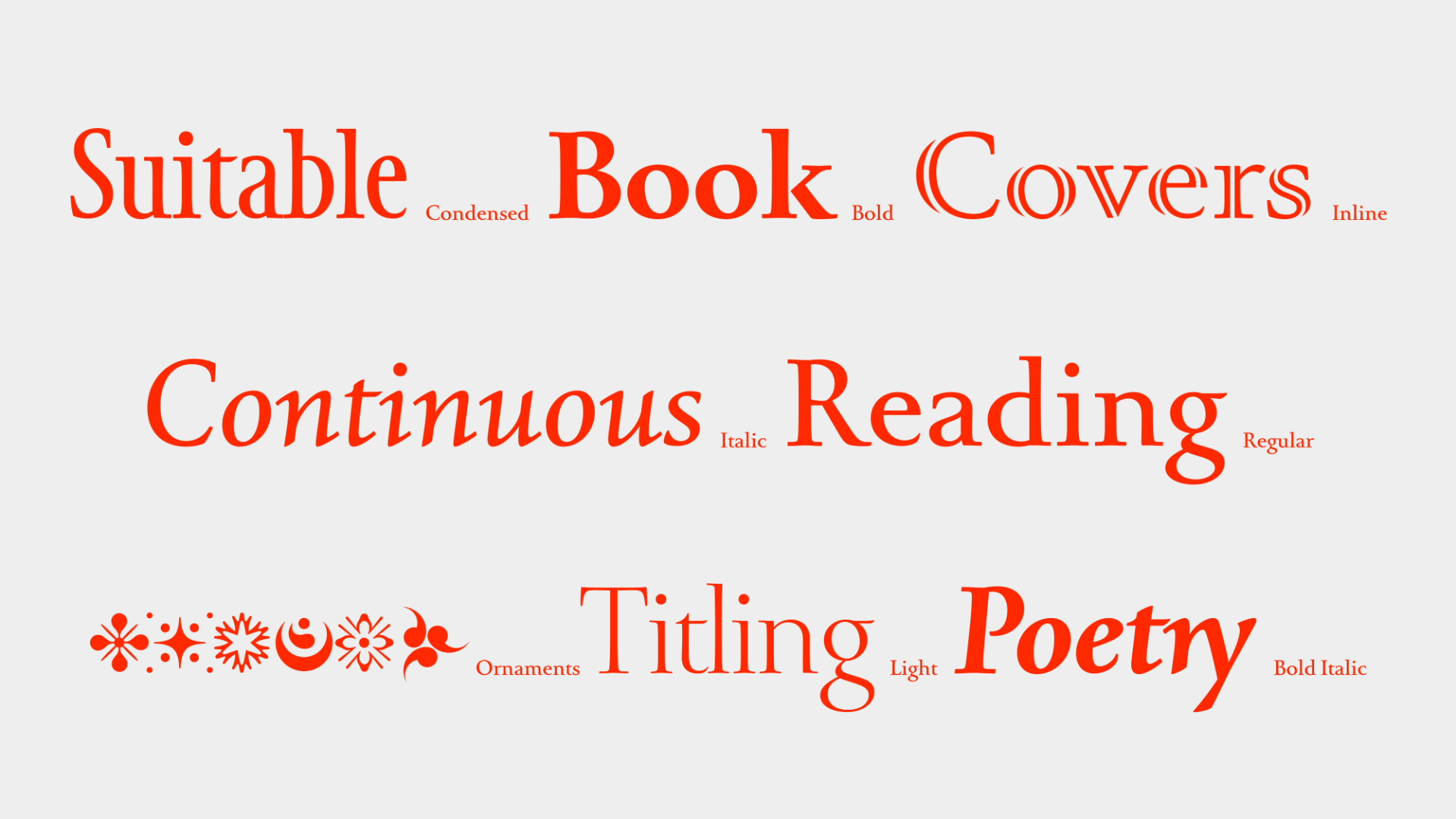
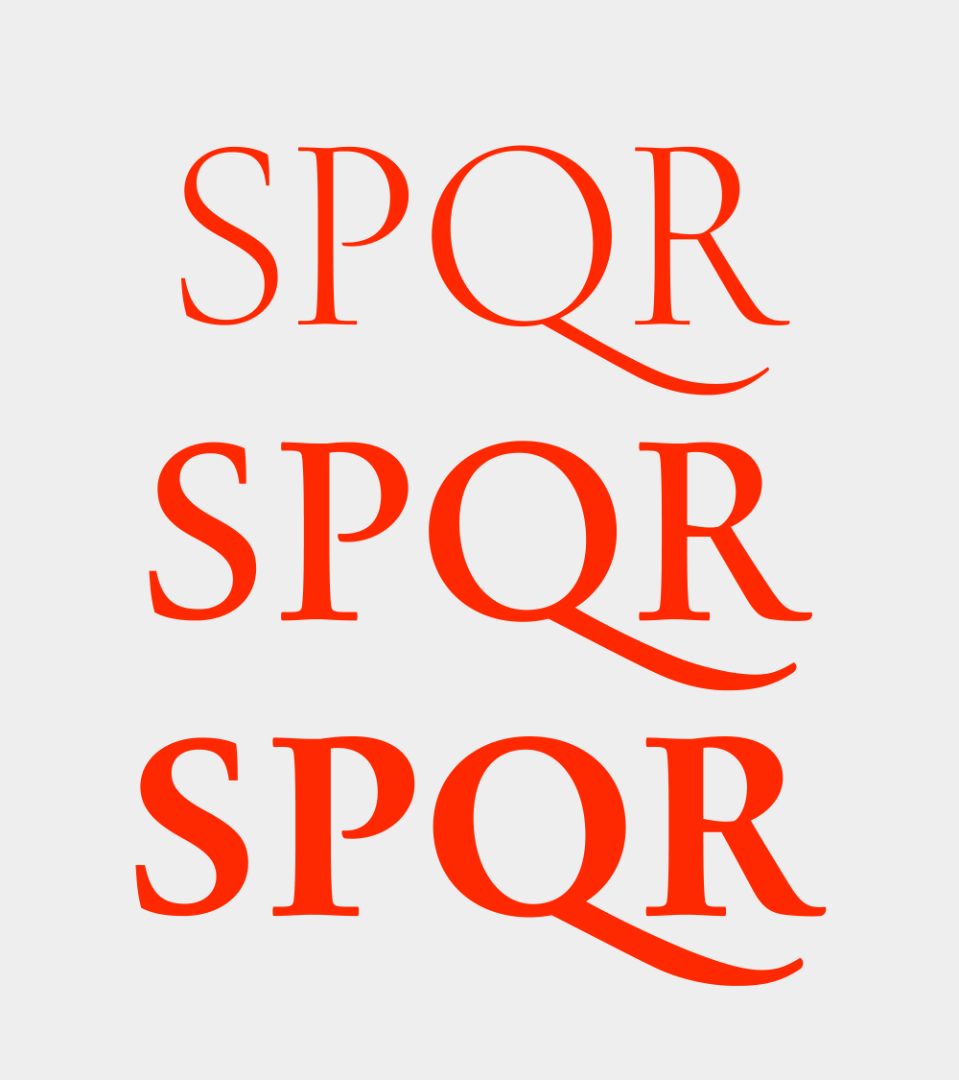
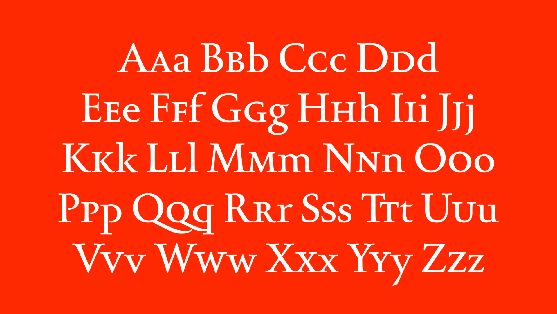
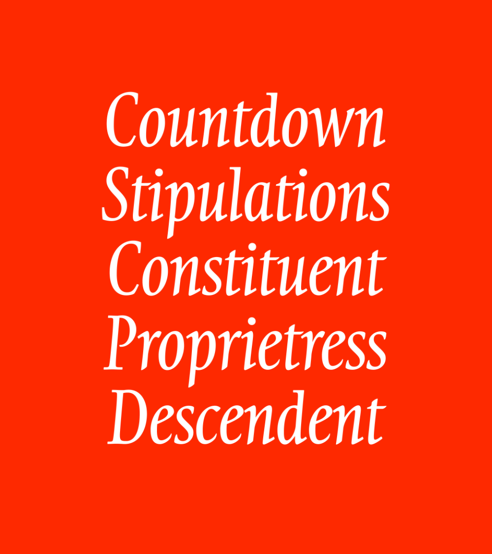
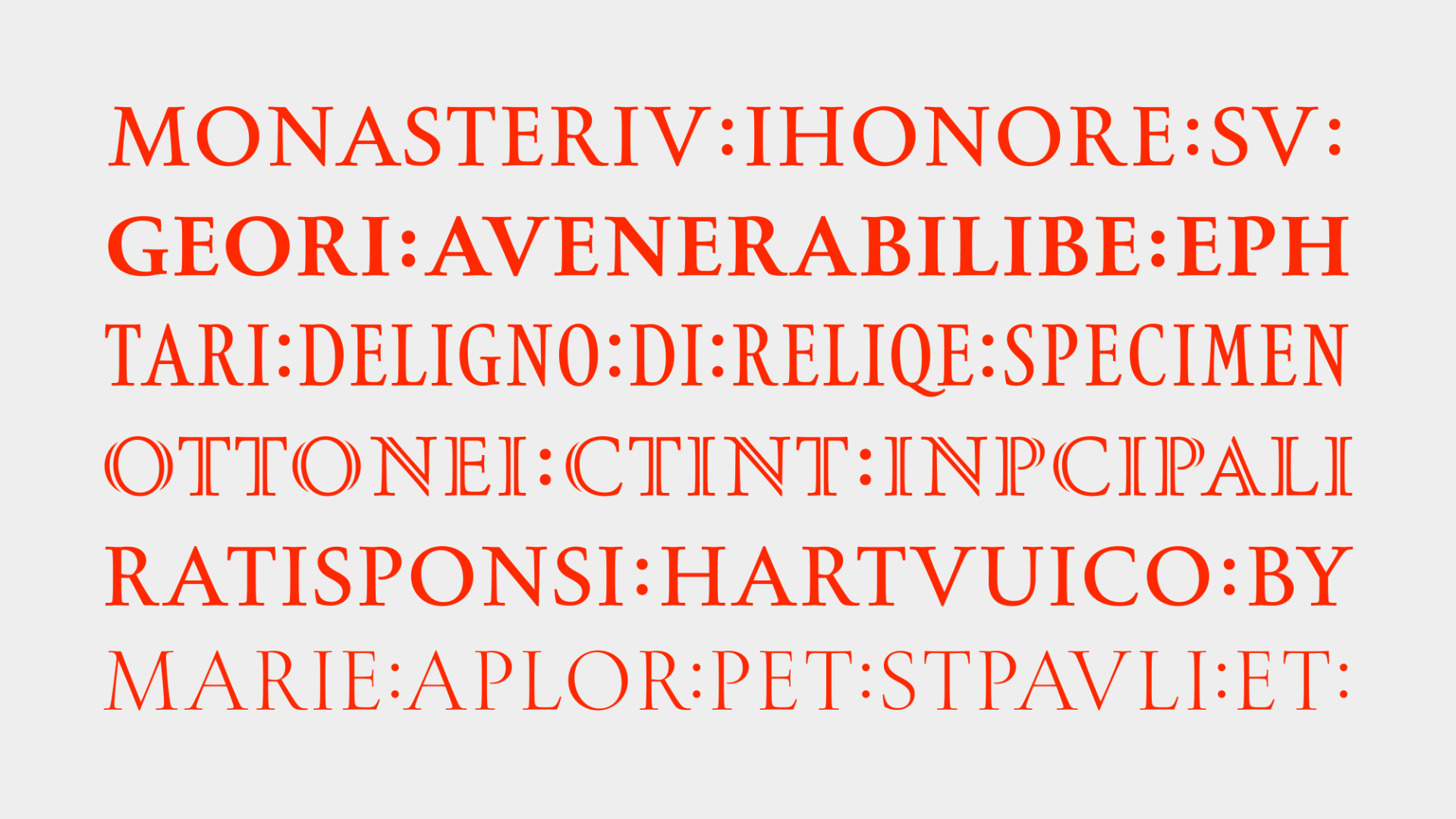
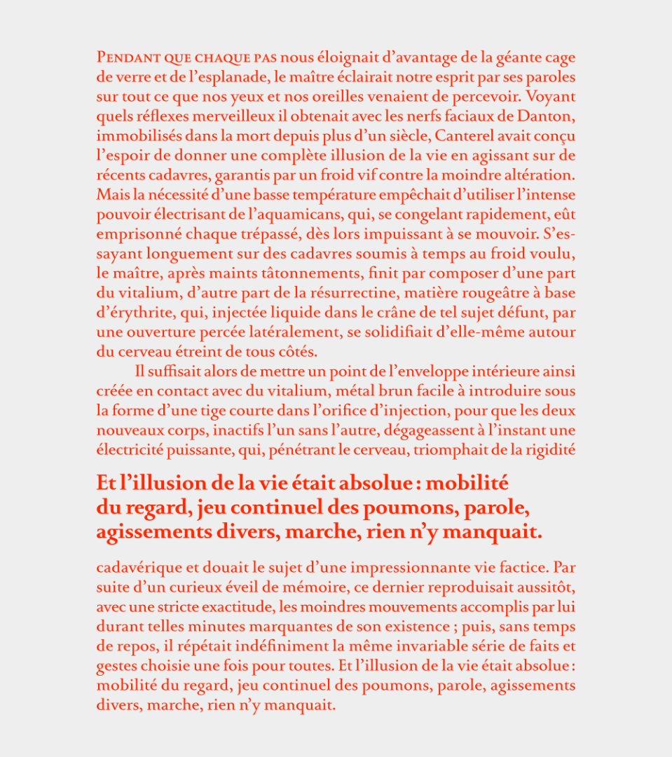
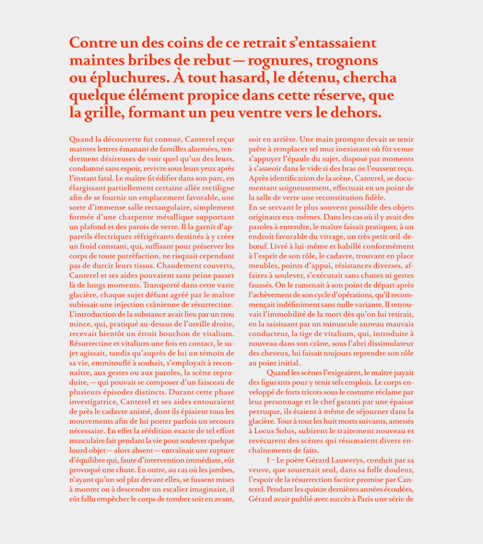
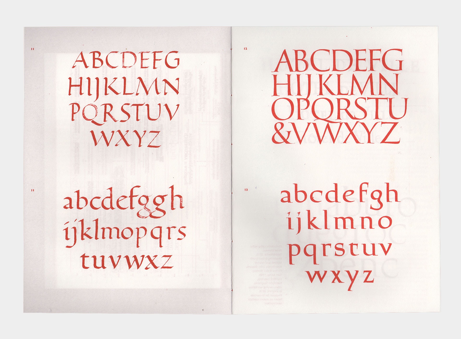
Arnaud likes to compare his project to a traditional dish which would never disappear. The project is detailed and built to last. Epitre is a text typeface family in which the lowercase construction is based on the roman capital principles. The aim was to create a more consistent relation between both upper and lower Latin alphabets. The design started from a calligraphic base, using a single broad brush, leading him to a very classical approach, sprinkled with an English touch. The text styles aim to be pretty invisible, as “it is a far more difficult to be simple than to be complicated”. A particular attention has been given to vertical metrics, contrast amount, proportions and spacing in order to achieve the most harmonious effect in reading size.
Arnaud Chemin
Arnaud Chemin is a French type and graphic designer. He first studied print and graphic design in Paris, then moved to the Ésad Amiens (France) to specialize in new media interactions. He also attended Écal (Switzerland), dedicating his time and effort to type design. He worked briefly at Typofonderie and Black[Foundry] where he was involved in brand identity projects.


Process
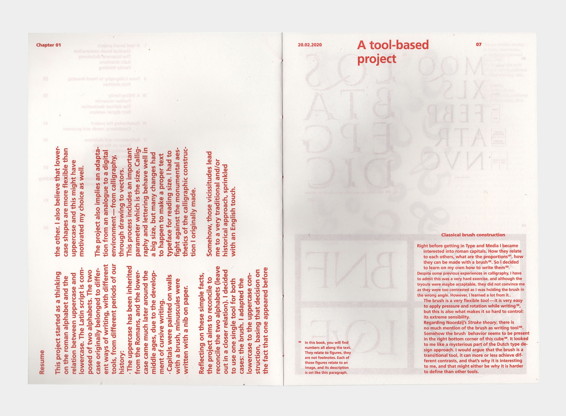
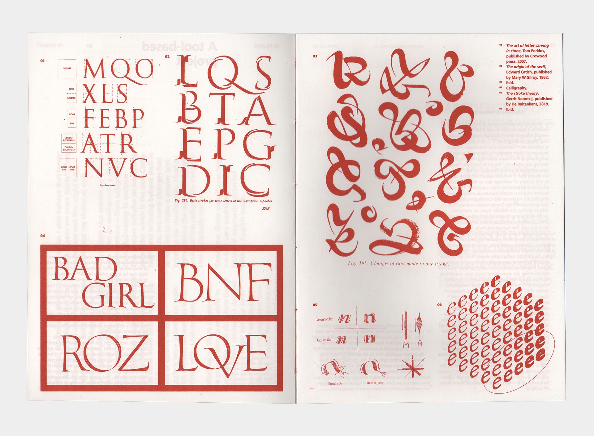
The Latin script is a bicameral script: we use two alphabets for a given language. Those two alphabets originally belonged to different ways of writing (different tools), from different periods of our history:
- The uppercase has been inherited from the Romans, and the lowercase came much later around the middle ages, due to the development of cursive writings.
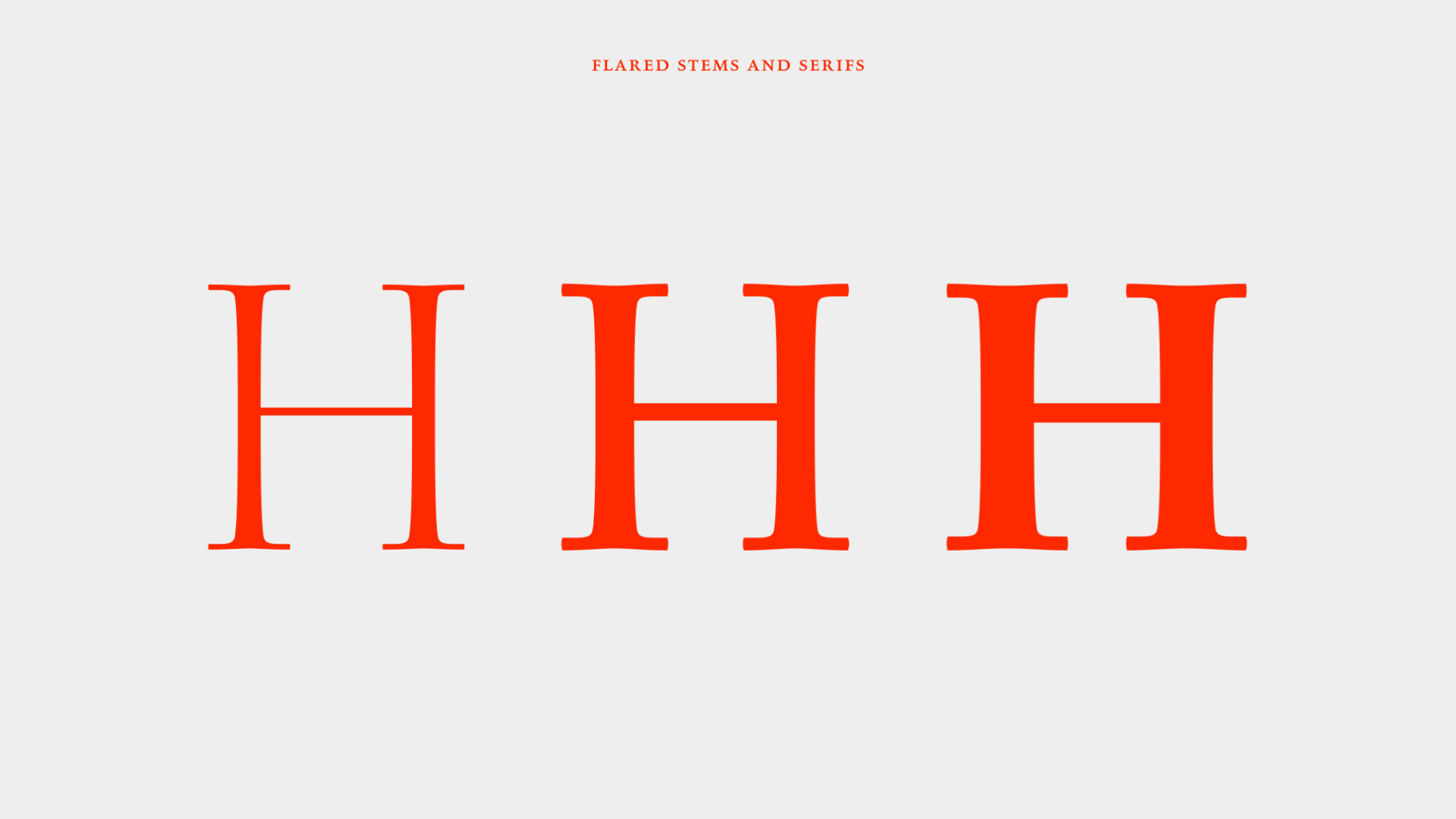
- Capitals were painted on walls with a brush, and minuscules were written with a nib on paper.
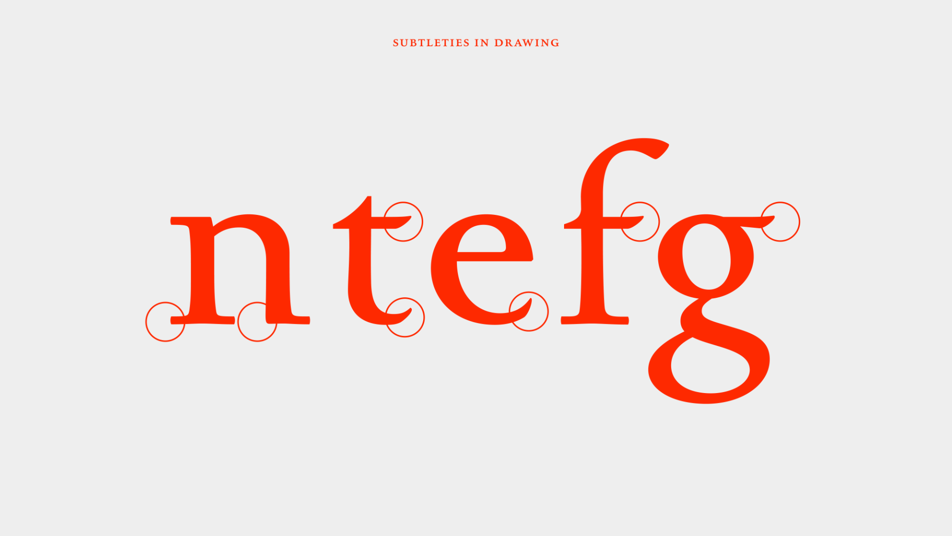
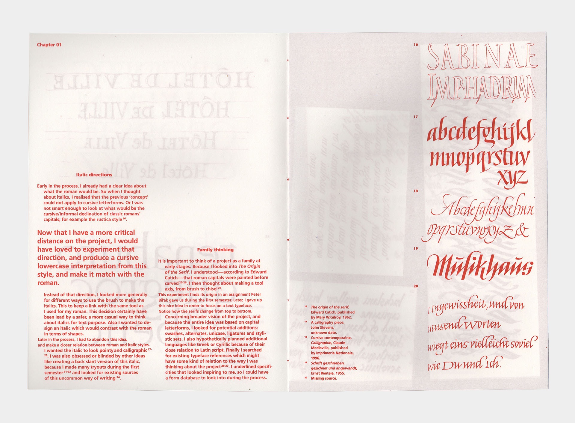
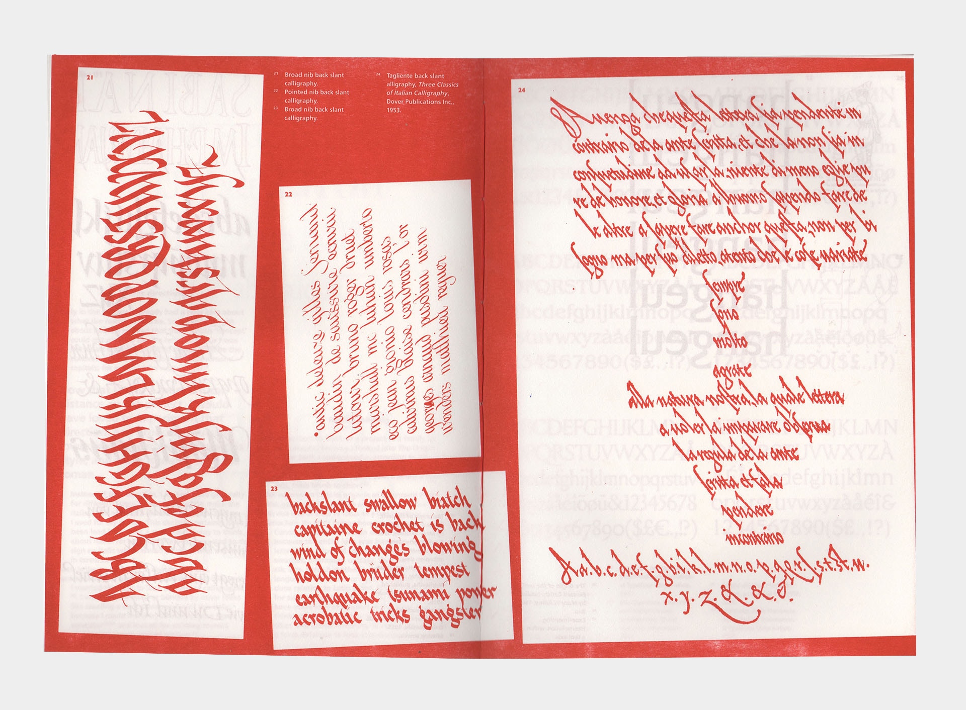
Reflecting on those simple facts, this project aims to reconcile those alphabets in a closer relation. To achieve this, I used a single tool as the basis for both cases: the brush. I adapted the lowercase to the uppercase construction, basing that decision on the fact that one appeared before the other. I also believe that lowercase are more flexible than uppercase, and this might have motivated my choice as well. The project also implies an adaptation from an analogue to a digital environment – from calligraphy, through drawing to vectors. This process includes an important parameter which is the size. Calligraphy and lettering behave well in a big size, but many changes had to happen to make a proper text typeface for reading size. I had to fight against the monumental aesthetics of the calligraphic construction I originally made.
TM20: Arnaud Chemin from TypeMedia MA on Vimeo .