Type and Media is a master’s course in typeface design at the Royal Academy of Art in The Hague (KABK) . In the first semester students have several modules to complete that are interspersed with a set of enlightening workshops covered by guest lecturers. During the second semester, students focus on their thesis project. This site showcases the final projects of the class of 2020.

A big thank you to the faculty and supervisors at Type and Media for their expertise, wisdom, and support during this especially difficult year: Erik van Blokland, Peter Verheul, Paul van der Laan, Peter Biľak, Françoise Berserik, Frank Grießhammer, Petr van Blokland, Marja van der Burgh, Tânia Raposo, Fred Smeijers, Just van Rossum, Jan Willem Stas, Ilya Ruderman, Aleksandra Samuļenkova, and Kristyan Sarkis, and Mário Feliciano.

This year we had online visits, talks and lectures from friends and colleagues from all over the locked down world. We are grateful and happy that they took the time to join us: Paul Barnes, Ken Barber, Diana Ovezea, Kai Bernau, Nikola Djurek, Liang Hai, Thomas Huot-Marchand and the ANRT students.

Thank you to all the generous people who made our exhibition and this showcase possible:
Jack Curry, Arrow Type, Antonio Cavedoni, OHno Type Company, Ben Kiel, Commercial Type, Andy Clymer, Mark Davies, Christoph Koeberlin, Arthur Reinders Folmer, Matthijs Sluiter, Frank Grießhammer, Liang Hai, Martin Tiefenthaler, Letterspace Amsterdam, Michi Bundscherer, Susana Carvalho and Kai Bernau, Krystian Sarkis, Mathieu Lommen, Dirk Uhlenbrock, Mark De Winne, Erik van Blokland, Albert Pinggera, Paul van del Laan, Nikola Djurek, Rasmus Andersson, Daniel Grumer, Troy Leinster, Lettermin, Noheul Lee and Loris Olivier, Marina Chaccur, Exlijbris FF, Jim Catel, Alexander Kremser.


Website by Nina Botthof, Renan Rosatti & Jan Šindler.

The typeface used is Obviously by OHno Type Company.

Huw Williams's header

Malham

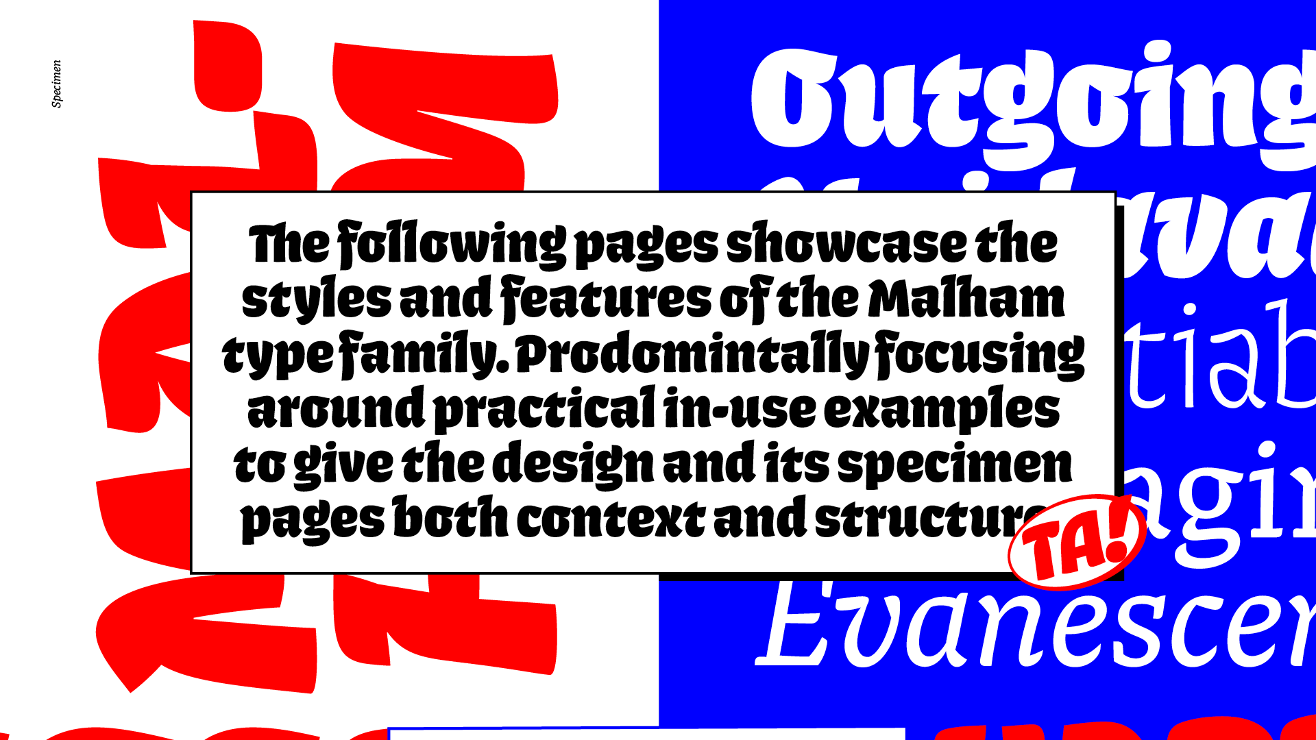
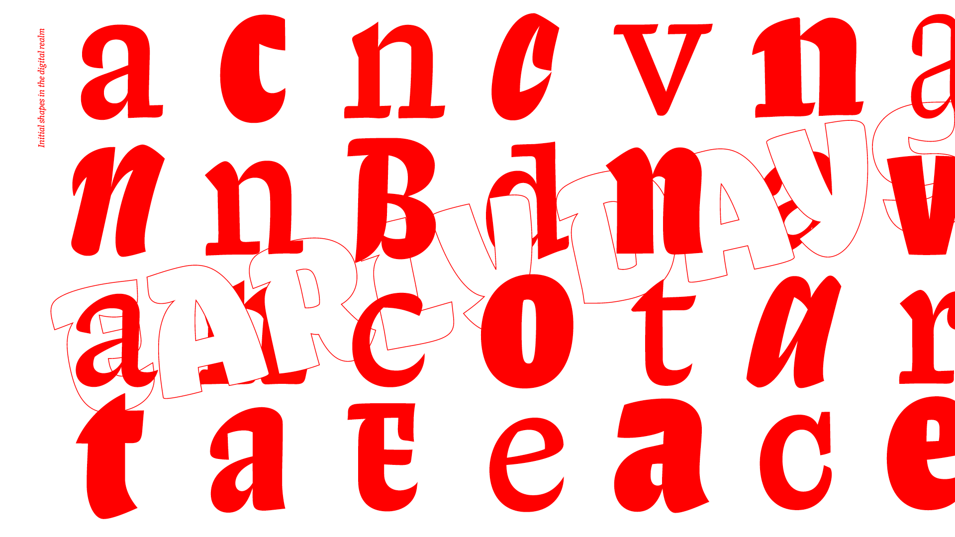
Malham is a type family that explores the middle ground between sans and serif. Malham became an amalgamation of a few distinct areas of typographic research including:

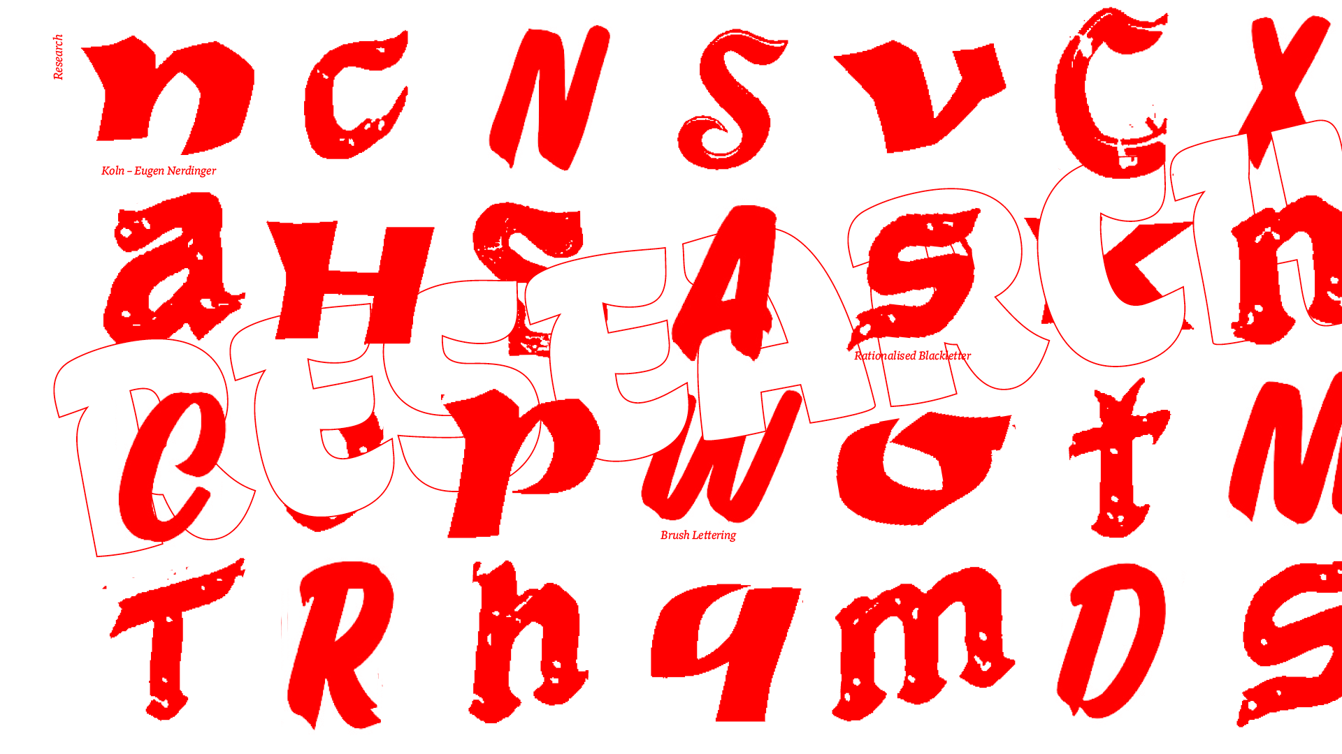
  • Examples of type that could be construed as SemiSerif
  • American sign painting and brush lettering.
  • Rationalized blackletter from the same geographical location.
  • Eclectic forms of vernacular type.

And over a handful of months, the project transformed into something completely unexpected. While still keeping an air of familiarity and ubiquity to its shapes.

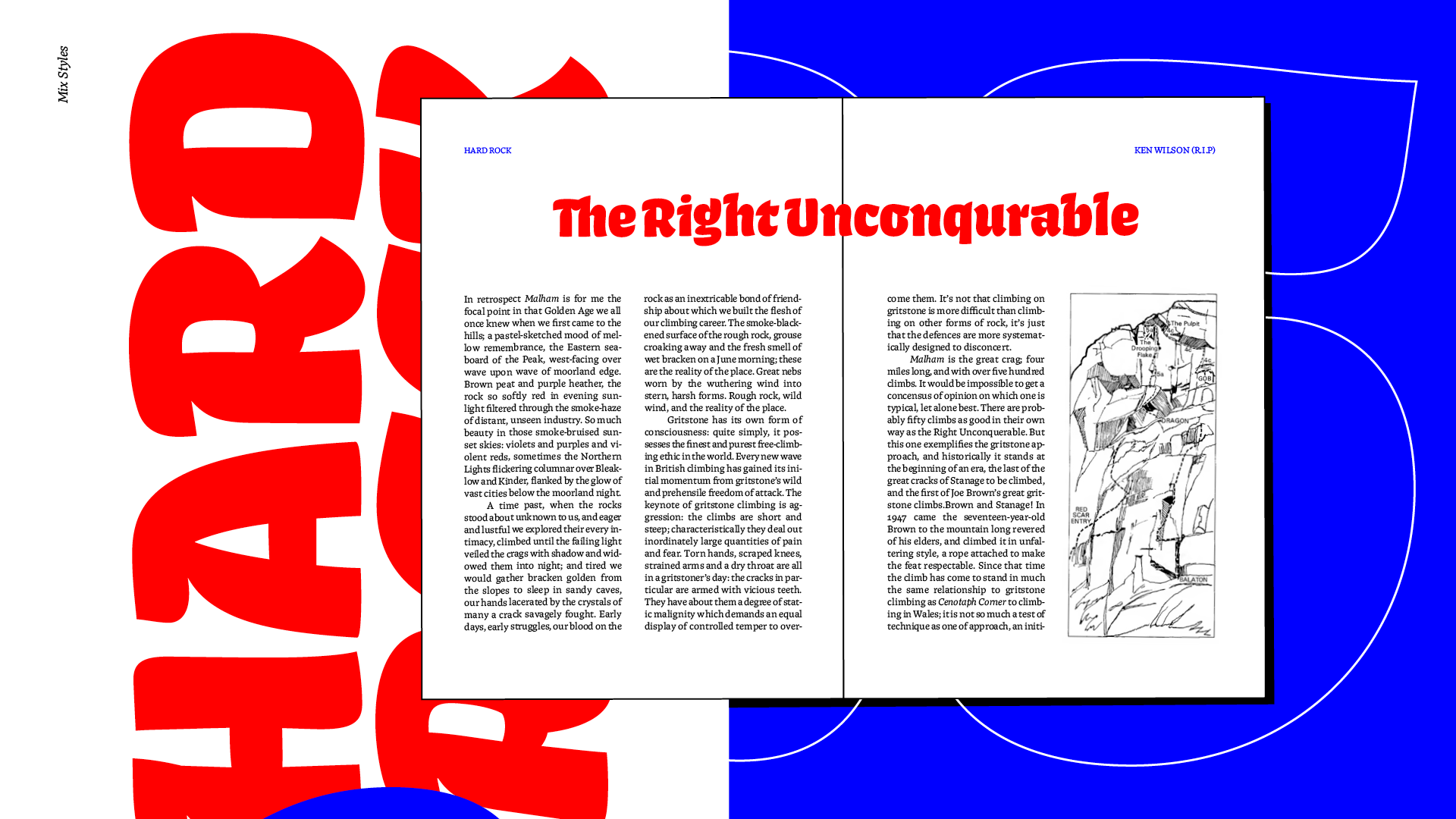
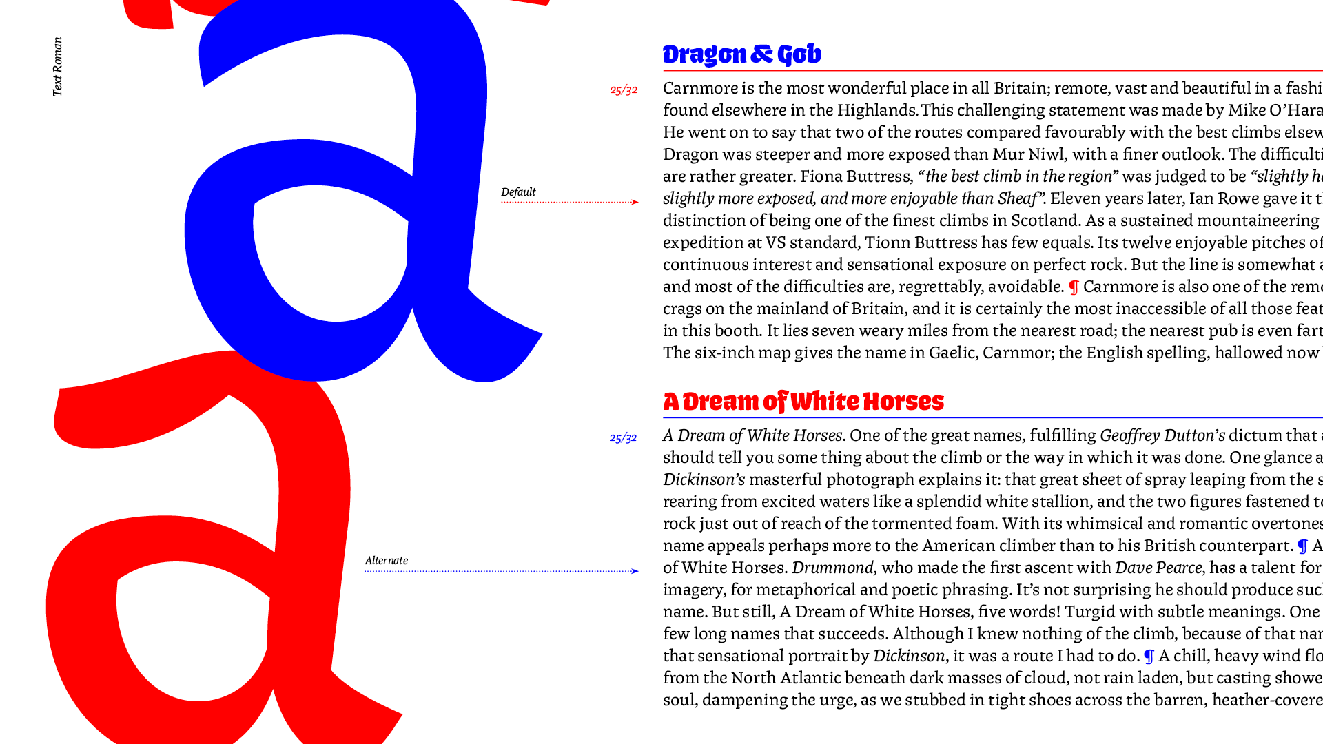
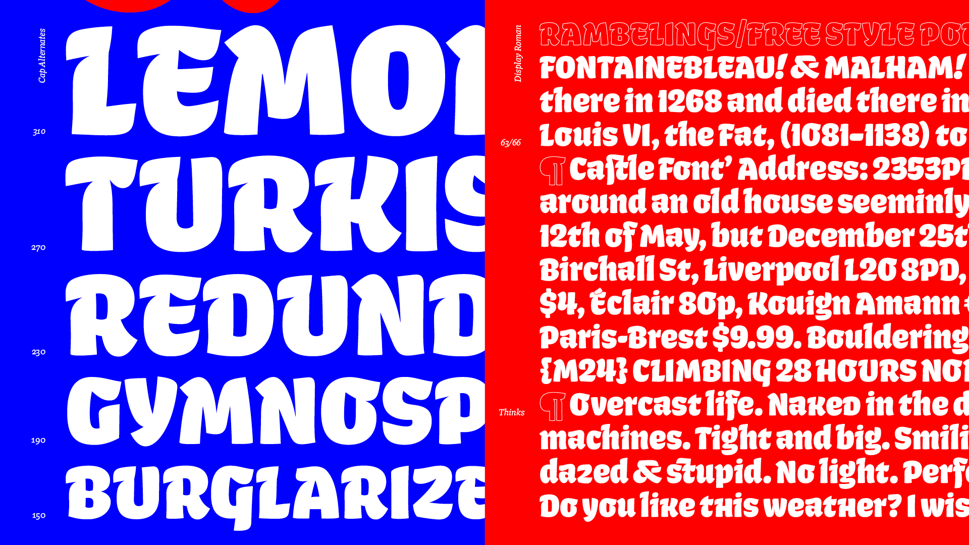
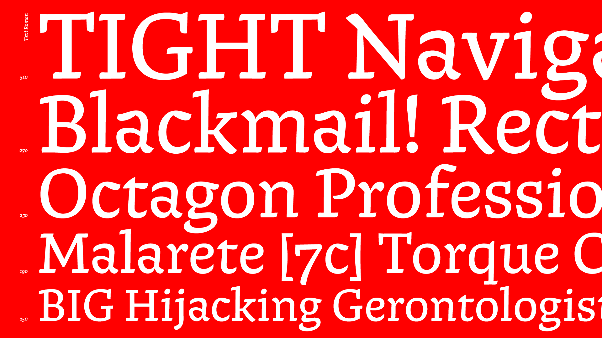
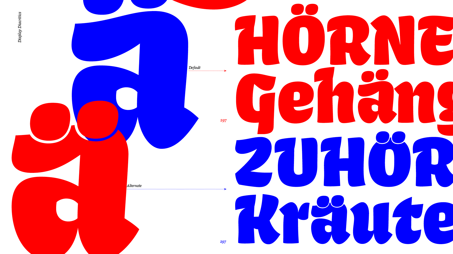
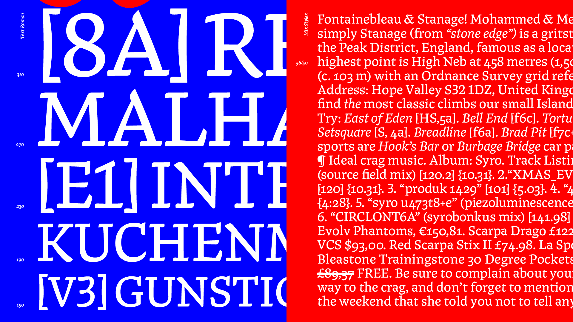
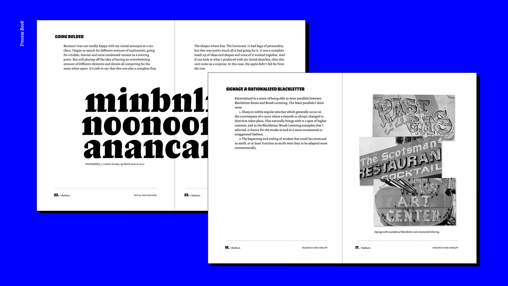
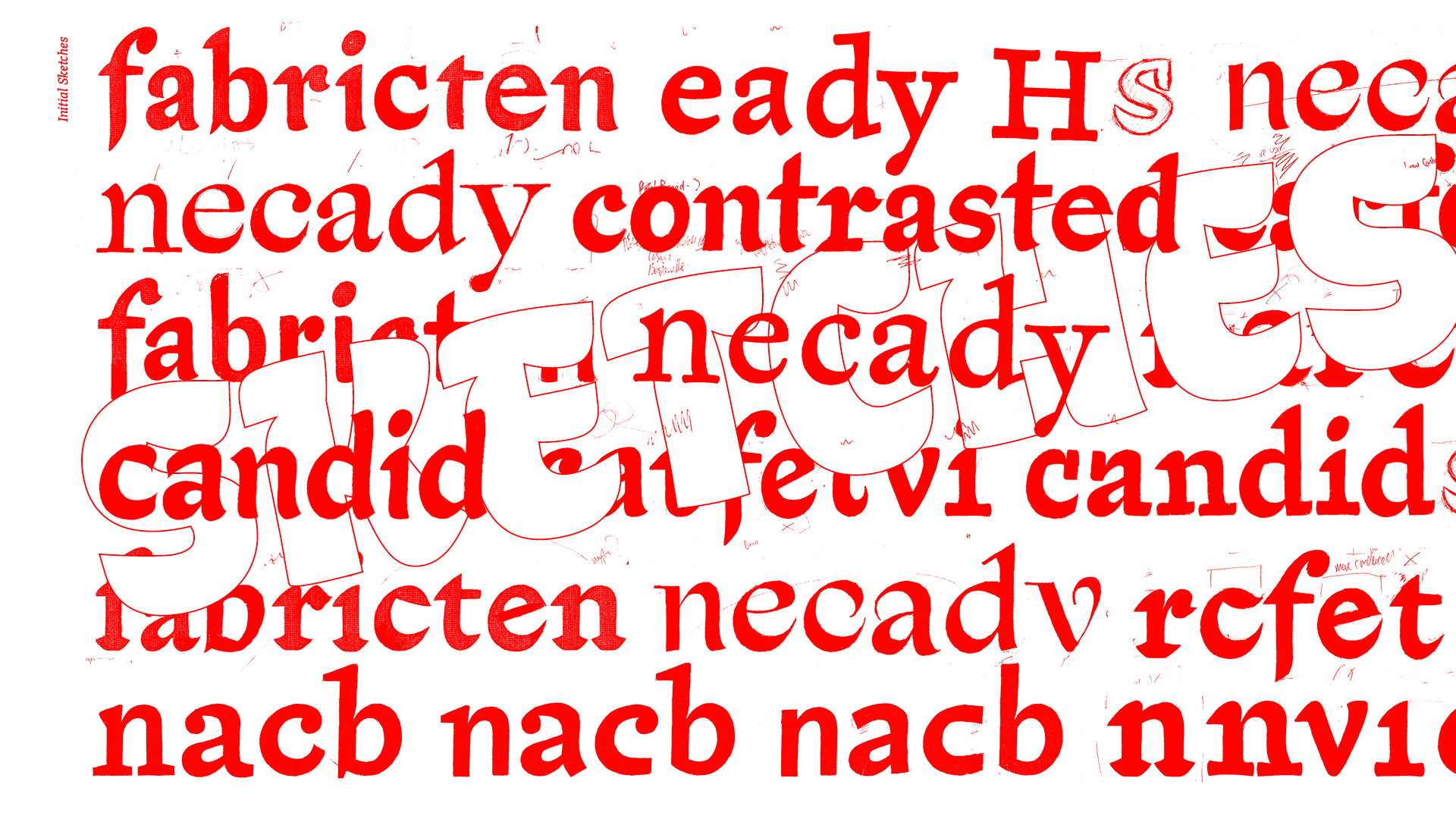
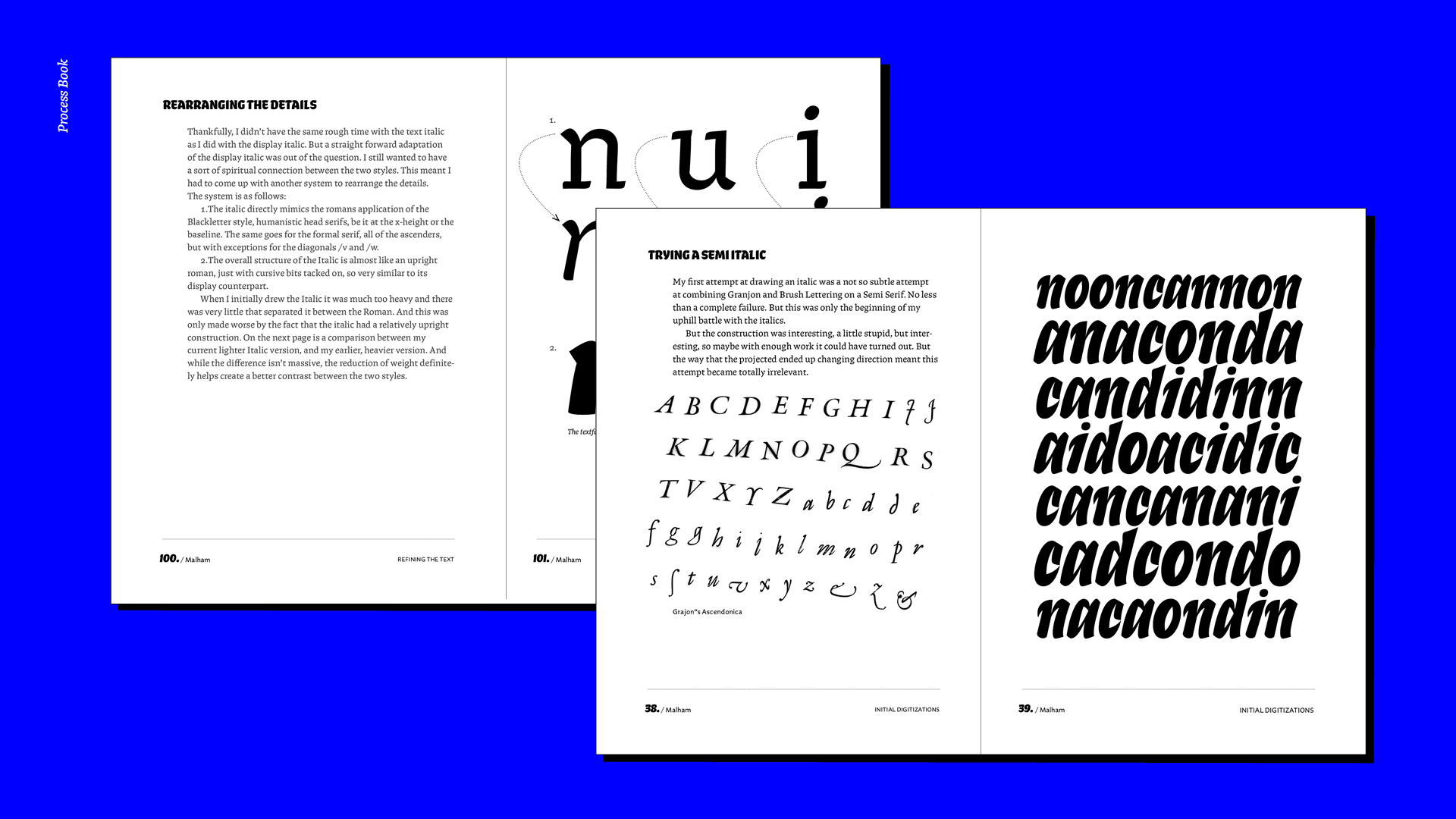
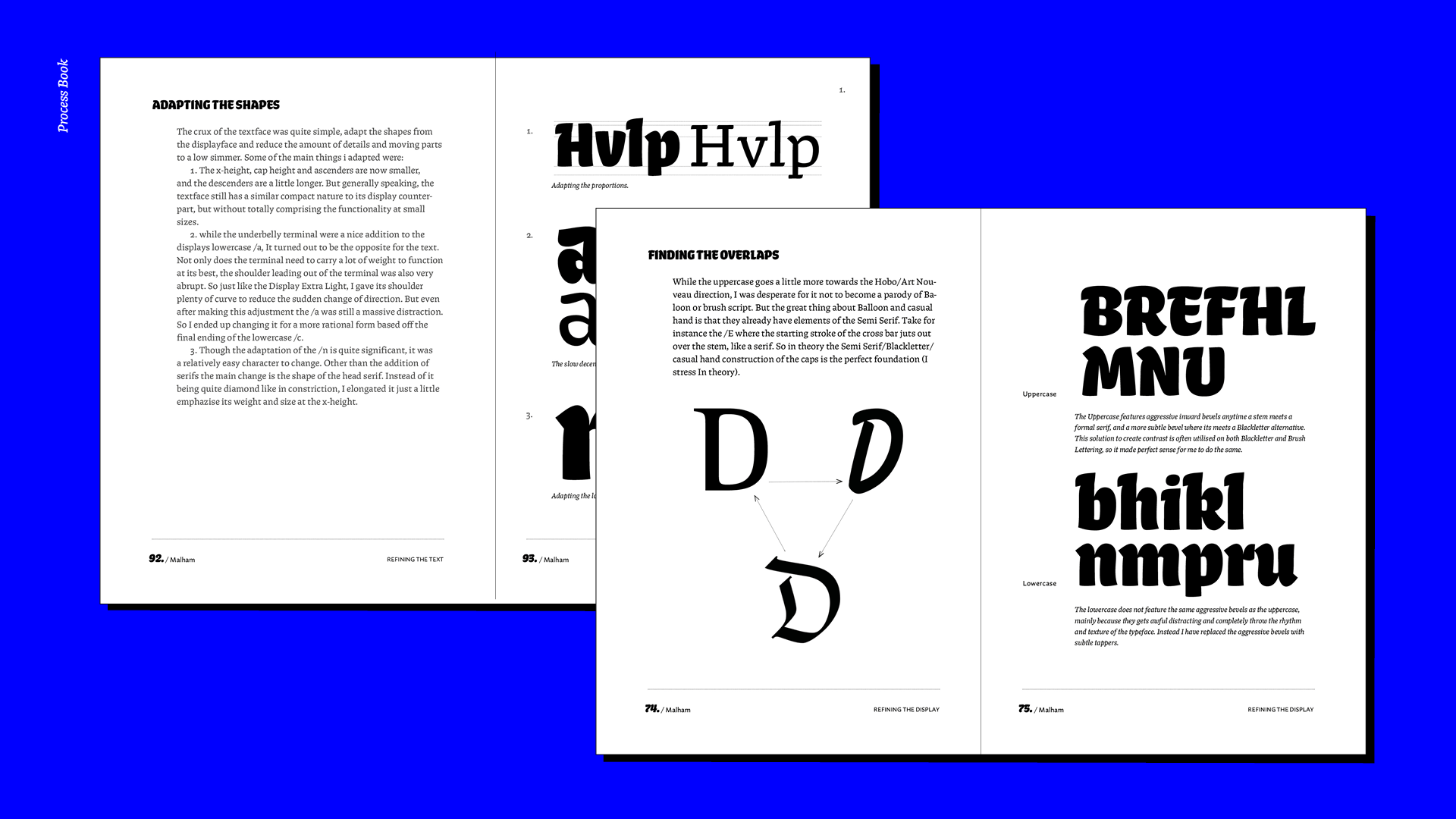
The Malham family is comprised of two main styles: Display and Text. The Display styles lean heavily on the findings of the R&D phase of the project. While the Text styles leave the idiosyncratic blackletter and brush lettering influences behind, elaborating on some of the more Dwiggins-esque qualities to better function at smaller sizes.

Huw Williams

Huw Williams is a type designer from the United Kingdom of Great Britain. As a retired climber, Huw abandoned the rock to live a more sedentary life of black and white, up and down, left and right. Now instead of worrying about friction and two finger pockets, he concerns himself with over obsessive point placements, confusing research proposals and what the French are doing (have done).

1 2 3 4 5 6 7 8 9 10 11 12

Process

1 2 3 4 5 6

TM20: Huw Williams from TypeMedia MA on Vimeo .