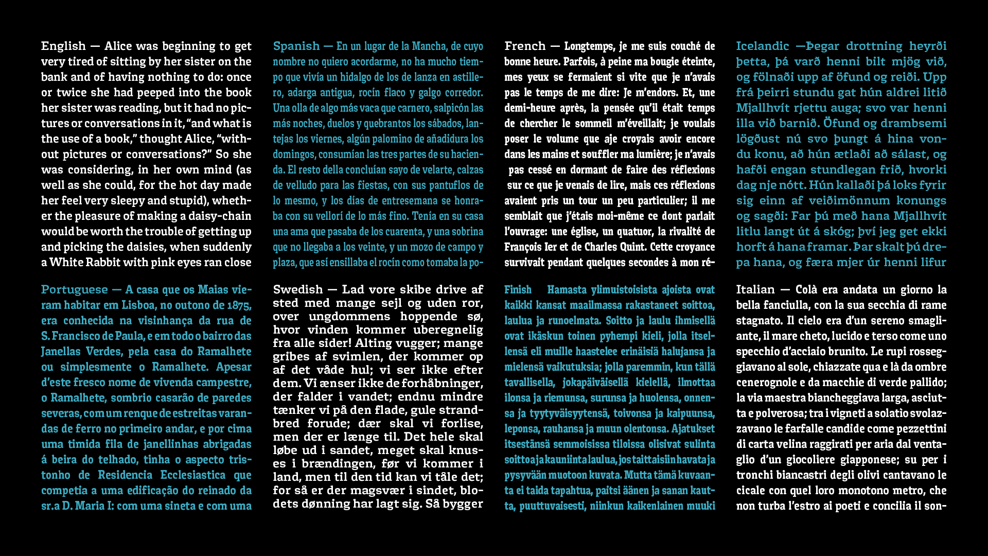
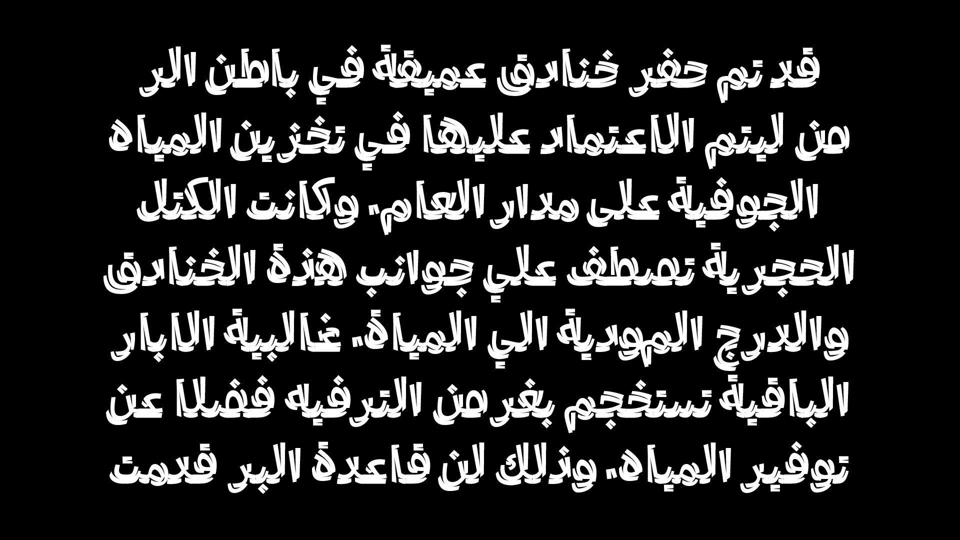
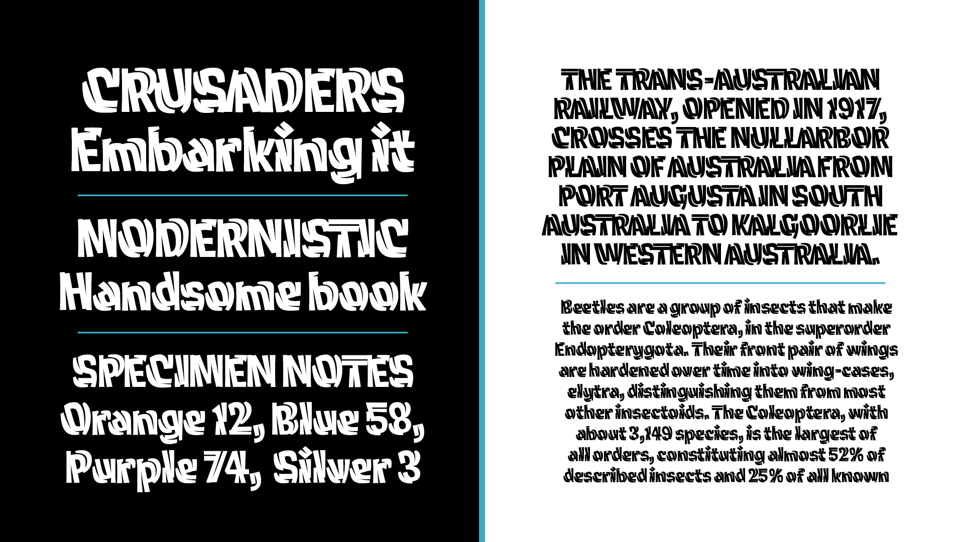
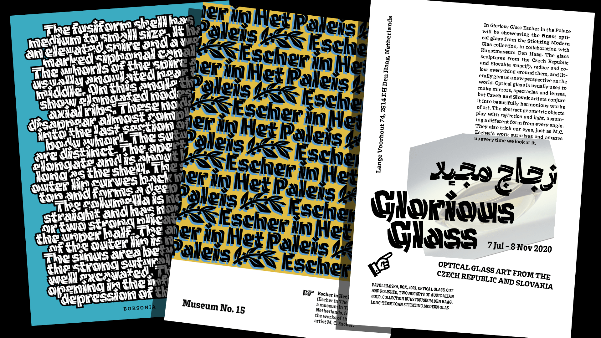
Type and Media is a master’s course in typeface design at the Royal Academy of Art in The Hague (KABK) . In the first semester students have several modules to complete that are interspersed with a set of enlightening workshops covered by guest lecturers. During the second semester, students focus on their thesis project. This site showcases the final projects of the class of 2020.

A big thank you to the faculty and supervisors at Type and Media for their expertise, wisdom, and support during this especially difficult year: Erik van Blokland, Peter Verheul, Paul van der Laan, Peter Biľak, Françoise Berserik, Frank Grießhammer, Petr van Blokland, Marja van der Burgh, Tânia Raposo, Fred Smeijers, Just van Rossum, Jan Willem Stas, Ilya Ruderman, Aleksandra Samuļenkova, and Kristyan Sarkis, and Mário Feliciano.

This year we had online visits, talks and lectures from friends and colleagues from all over the locked down world. We are grateful and happy that they took the time to join us: Paul Barnes, Ken Barber, Diana Ovezea, Kai Bernau, Nikola Djurek, Liang Hai, Thomas Huot-Marchand and the ANRT students.

Thank you to all the generous people who made our exhibition and this showcase possible:
Jack Curry, Arrow Type, Antonio Cavedoni, OHno Type Company, Ben Kiel, Commercial Type, Andy Clymer, Mark Davies, Christoph Koeberlin, Arthur Reinders Folmer, Matthijs Sluiter, Frank Grießhammer, Liang Hai, Martin Tiefenthaler, Letterspace Amsterdam, Michi Bundscherer, Susana Carvalho and Kai Bernau, Krystian Sarkis, Mathieu Lommen, Dirk Uhlenbrock, Mark De Winne, Erik van Blokland, Albert Pinggera, Paul van del Laan, Nikola Djurek, Rasmus Andersson, Daniel Grumer, Troy Leinster, Lettermin, Noheul Lee and Loris Olivier, Marina Chaccur, Exlijbris FF, Jim Catel, Alexander Kremser.


Website by Nina Botthof, Renan Rosatti & Jan Šindler.

The typeface used is Obviously by OHno Type Company.

Jamie Chang's header

Cleft

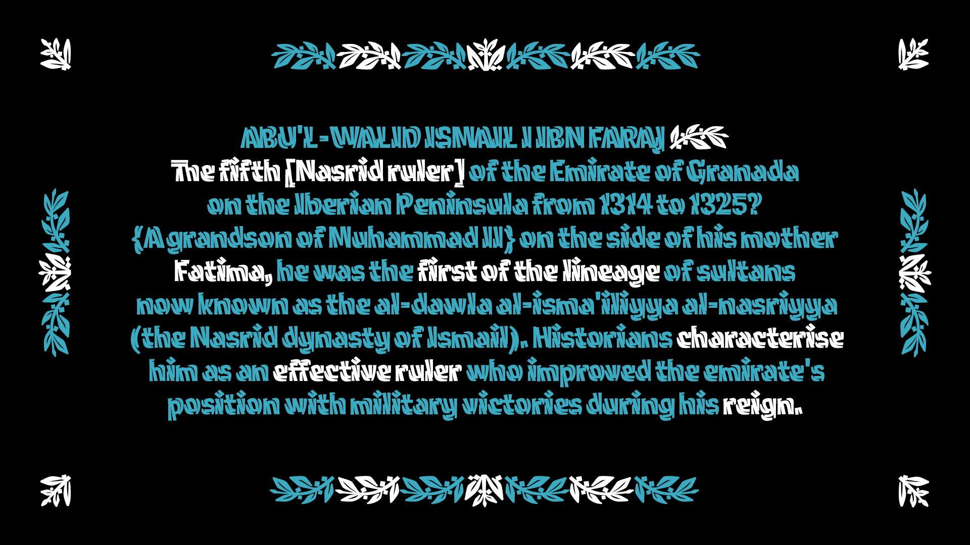
Cleft explores the different characteristics that make up the texture of our text. From the internal to external qualities that help create the pattern and rhythm in the text we read. It is designed with two main styles that play with these concepts. A further experimental study into Arabic forms was done using the Twinline construction to investigate whether this unique construction would be viable as a multi-script system.

Cleft Twinline (A combination of the words twin and inline) focuses on the relationship between independent internal letters, and the external shapes that help to complete the letter forms. Deriving itself from inline forms, it challenges conventional models of inline construction.

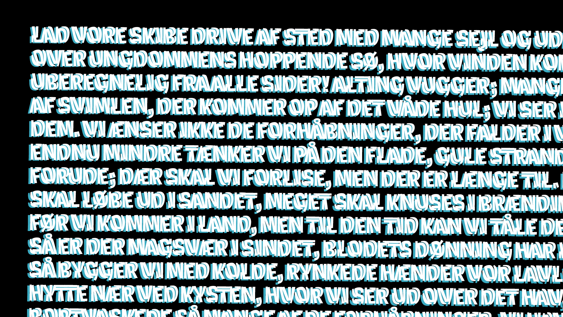
Cleft Text explores emphasis within a line of text. It is designed with a top-down tapering effect within each letter. This taper creates a strong horizontal emphasis along the x and cap heights, and a weaker presence along the base of each character, making it so the text feels heavier on top without falling over. Cleft Text has a width axis along with weight, in order to allow for economization of space.

Jamie Chang

Jamie Chang is a Canadian type designer and letterer. Passionate about type, his work delves into the expressiveness and textural qualities of type design. Foosball table oiler, t]m fantasy sumo organizer, and man on the other continent. With a background in graphic design, Jamie’s work encompasses a variety of disciplines, from branding, lettering, to typography. Jamie has previously worked for Canada Type, and The Northern Block .

1 2 3 4 5 6 7 8

Process

TM20: Jamie Chang from TypeMedia MA on Vimeo .