
Ceres
Ceres is a typeface with a macabre atmosphere. The initial idea was to give different characters of a story their own typographic voice. I wanted to capture the personification of Death, a character in the stories of Terry Pratchett, in a typeface. The plan changed, but the inspiration stayed the same. Ceres developed into a diverse family of five styles: Scythe Roman and Italic for larger sizes, and Sickle Light to Bold for smaller sizes.
The Scythe Roman owes its name to the sharply curved serifs, whose shapes are reminiscent of a scythe. The Italic, on the other hand, interprets the underlying theme in a completely different way. Its fluid curves with horn-like ends create the wickedly diabolical character. Developing the counterpart for smaller uses was much more challenging. It needed linear details and a sturdier look. While the Light weight is an adaption of the Scythe style, used in smaller text; Regular and Bold deviate further from the shapes and are specially adapted for longer texts.
Nina Botthof
Nina Botthof is an Austrian designer. After learning fashion design and dressmaking she studied Information Design and Communication Design at the University of Applied Sciences FH Joanneum in Graz. She also completed internships and semesters abroad in London, Berlin and Frankfurt. Her work focuses on emotional, but functional expression. Coming from a background in fashion, she likes to experiment with materials and also introduces this into her graphic design work.


Process
The very first thought on this project emerged when I saw the use of smallcaps to highlight the voice of Death in Terry Pratchett’s Discworld novels. This typographical hint sparked the idea that type can play a special role in storytelling. I grew fond of the idea to tailor a typeface to represent only the character of Death.
I thought of some characteristics that are apparent for the character and made a TypeCooker recipe based on adjectives: stiff, daunting, bone-like, strong, morbid and peculiar. With these characteristics, I sketched as many different designs as possible.
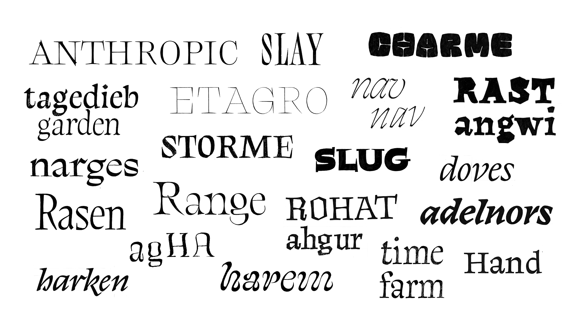
I noticed a preference for light weights and realised that I needed to focus on the sharpness of the drawings. The serifs needed to be pointy to create a dangerous and uncomfortable looking typeface. I started to digitise and experimented with different serif treatments. The culmination of weight in the Light style was an interesting feature that I wanted to explore further. With bracketed serifs I could put even more weight on these joints which resulted in a rather organic looking texture.

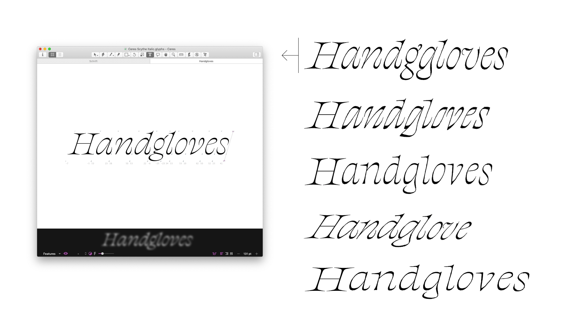
Designing a corresponding text version was rather difficult. I wanted to keep the sharpness of the Display design, and optimise it for reading sizes. But I was never really satisfied with how the styles worked together. Therefore I wanted to explore some other possible styles: an Italic and a Bold for the Display style and an Optical Size.
Designing the Italic came to me quite easily. I made several different drafts and soon decided on a playful version with twisted stroke endings.
The Bold style was much more challenging. How would the weight behave? Would it have reversed contrast, or would it gain weight in the stems? I tried both options and experimented with a three-master-interpolation to see how the weight inbetween behaves.

For the Optical Size I interpolated the display with a sketch that was designed with more weight and less contrast. Then I also created a bold master for this Optical Size to explore what a regular weight could look like.
There were so many possible styles to explore, but I knew that I would not be able to finish all of them for my final project, so I had to make a choice. I decided to take a step back and have a critical look on which styles are most useful. For this purpose I did a small experimental layout to see the potential of my styles.

I already knew that I wanted to continue to work on the Display Roman and the Italic. But this test also showed me that the Optical Size worked well together with the Display styles.
At first the design of the Optical Size had an irregular rhythm, because the weight was not consistent throughout all glyphs, especially in the bolder weights. This was also due to the reversed contrast model. Therefore I decided to make the Bold and Regular more upright and to have an increase in angle from Light to Bold. I also adjusted the proportions to have longer ascenders and decenders and a larger cap-height in order to improve reading quality.

After refining all styles, I noticed that they do not fit in the Display/Optical Size model that I originally thought of. Therefore it seemed to be suitable to think of more abstract terms to describe their purposes. I finally decided to group them into Scythe and Sickle, not only because the terms are an abstract metaphor for large and small, but also because they fit the theme.
TM20: Nina Botthof from TypeMedia MA on Vimeo .